Water Lily Conversion
There are a wide range of tools available to the photographer today that can be used to turn a poor photo into something quite nice if you take the time to learn how to use them. This post will show you the workflow for how I completely changed the appearance of this image.
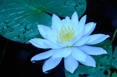
To the left is a photo shot with a Nikon D300 using an 80-200mm lens from the back of a canoe as I floated by. The flower is over exposed, there are numerous hot spot reflections, the tears in the lily leaves are distracting and the overall color is way off.
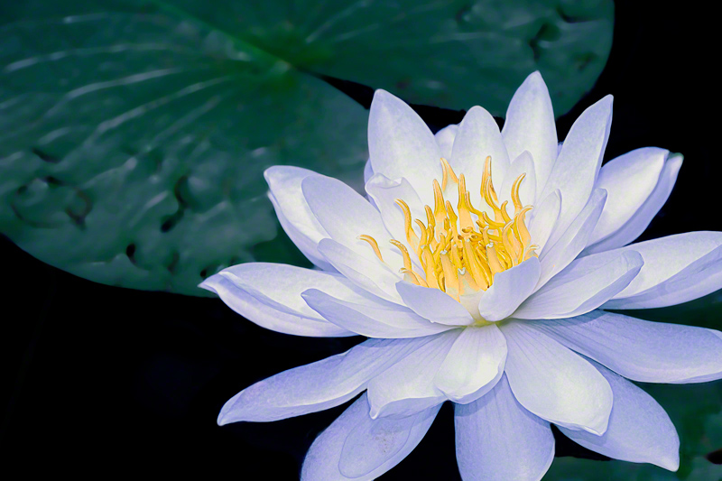
The image below shows what can be done with a little work, time and patience!! All of the changes were done in Photoshop.
 Step 1. Make a background copy of the image. Where you go from this step can be a bit of a personal choice but here is the work flow I used for this image.
Step 2. I cropped the image for better composition and to eliminate the torn lily leaves in the bottom right corner.
Step 3. Use the quick select tool to select the entire flower and save the selection. Refine the selection as needed to be as precise with the outline as possible.
Step 4. Select the inverse of the flower and begin to make modifications to the background lily leaves. For this image I used both the guassian blur filter to soften the background as well as the brightness/contrast tool to bring down the contrast so as to not distract from the main subject flower. The cloning tool was used to eliminate hot spot reflections as well as repair distracting blemishes.
Step 5. Load the flower selection and work toward proper exposure and better color. I used both the exposure as well as the shadow/highlight tool to bring some detail into the flower petals. With the flower still selected I then used the color balance tool to eliminate the over blue cast in the flower petals and created the violet highlights. I liked the violet contrasted against the bright yellow stamen and anther structures in the middle of the flower.
6). A dry brush effect was added to the flower. If you look closely at the image you will see that there is just a small amount of texture in just the flower (not the background). This did two things, provided a little more detail to the image and made it look as though it were a painting.
7) For the final touches I used the color saturation tool to pump up the yellow as well as the levels tool to create better overall contrast across the entire image.
This project consumed a few hours time. Its a little trial and error when you are learning but for me if I am not out taking new pictures my second choice would be to sit and edit them on a rainy day. Contact me if you have questions